
More than 30 interviews, design critiques, and research used to prioritise metrics and understand supervisors’ mental models.
Product design case study · Contact centre operations
Supervisors
& data
Helping contact-centre supervisors spend less time preparing and interpreting operational data, reduce cognitive load, identify emerging issues and act before they escalate.
At a glancePlatform scale
& project impact
& project impact
180countries with deployments
+10mdevelopers using the platform
25%supervisor efficiency improvement reported
+500large enterprise organisations
+300kactive customer experience professionals across the platform
20–60sless handling time reported in cross-channel deployments
40%responding faster when demand suddenly rises
**%historical reporting reduction in this initiative

01
Context
Supervisors manage large volumes of customer interactions and team performance data.
They often rely on manual processes to identify patterns, understand issues and determine where attention is needed.
Teams generated more than 1,500 historical reports each month, with some customers exporting thousands. Producing these reports created recurring costs and added preparation work before supervisors could identify operational issues.
I focused on the supervisor environment because this user group lacked dedicated product support. Supervisors needed to balance staffing and queues, protect service commitments, prevent avoidable financial loss and maintain customer experience.
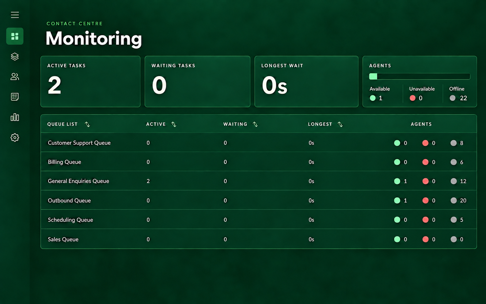
Active tasks2
Waiting tasks0
◉⌁+▥02
Problem statement
Limited visibility, manual work and high cognitive load made it difficult to maintain awareness across teams.
Supervisors had to move between tools and reports to see what was changing across queues and channels, understand whether a signal was healthy or at risk, and decide what to do next.
- Fragmented information: metrics and queue context were spread across screens and historical reports.
- Lack of operational visibility: supervisors could not consistently see whether a queue was healthy, approaching a threshold, or experiencing a new versus persistent issue.
- Manual effort: supervisors had to prepare data, identify outliers, and decide on action before they could respond.
- Usability and accessibility gaps: the existing experience did not meet the intended AAA standard, and long names made dense operational data harder to scan.
- Extensibility and interaction gaps: the screen was not designed to accommodate new metrics, while expected controls such as ordering and Select all were limited by technical constraints.
How might we…
How might we reduce the time supervisors spend understanding what’s happening, identifying emerging issues and deciding what to do, while lowering manual effort and cognitive load before escalation occurs?
03
Role & team
End-to-end ownership across the supervisor experience.
I worked end-to-end from research through monitoring, reporting, thresholds, alerts, and notifications. The wider supervisor area also included an administrative experience with a separate ownership model. I collaborated closely with that work during the early phases; as the initiative expanded and the organisation changed, I took ownership of both experiences.
This walkthrough focuses on the supervisor monitoring experience. The administrative experience is outside the scope of this case study, but it can be shown in an approved supporting image.
Product designer (me)Product manager
Engineering managerDeveloper / UI engineer
ArchitectContent designerContent writer
04
Research & approach
From making data available to helping supervisors act on it.
Weekly checkpoints with customers who had adopted the feature helped test assumptions and shape the next phase.
AI supported interview capture, tagging, pattern identification, and consolidation. Interpretation remained human-led.
Notifications→Data with context and colour-coded status→Action
05
Foundations
Making the design system work for data.
The existing design system was not built with data visualisation in mind. I worked with the design system team to introduce patterns for status, metrics, thresholds, tooltips and data-heavy interactions.
Reusable patterns → clearer monitoring experiences
06
Key design decisions01 02 03 04 05
Make operational data easier to act on.
Lead with context
Surface the channel, queue and time frame before the metric detail.
Keep the hierarchy consistent
Use one reusable card structure for changing data and views.
Turn thresholds into action
Make health states clear so supervisors know what needs attention.
Design for scale
Extend the same model across channels, metrics and future workflows.
Create a clear hierarchy
Separate the card title, metric title and value so channel names do not repeat across metrics or create inconsistent reading patterns.
Project impact & evidence
- 30+ interviews and design critiques informed metric priorities and supervisors’ mental models.
- Monitoring coverage expanded from 11 to 33+ metrics across real-time and historical reporting.
- Customers were generating 1,500+ historical reports each month, creating recurring preparation work.
- The prior workflow required 3+ hours/day of report preparation and checking; targeted monitoring, thresholds and notifications shifted supervisors towards proactive action, alongside a three-digit reduction in monthly reports per customer.
07
UI structure
A reusable structure for reading the operation.
The experience was designed as a system: page-level context, configurable data tiles, and a table for detail. Select a layer to see how the structure worked.
Page structure
Orient first, then let supervisors focus.
The page established context with a title, tabs and monitoring controls, then surfaced the most important summary metrics before the detailed table. Alerts, profile controls and Edit view remained available without competing with the operational content.
Context & navigationPage title, tabs, alerts, profile and Edit view keep the monitoring context available.
Summary cardsConfigurable data tiles surface the metrics supervisors need most.
Detailed tableQueue-level metrics provide the detail needed to investigate and act.

Card anatomy
Each tile had a clear job.
A card could contain up to three metrics. The structure kept the hierarchy consistent while allowing the content to change by channel, cross-channel view and metric type.
Voice
Metric name21m 12s+1m 56s
Scalability
Build the structure as demand grows.
The same data-tile pattern could grow from one channel to a wider operational view. Each new tile loaded with the same hierarchy: channel, metric, value and health state.
A card could contain up to three metrics. The structure kept the hierarchy consistent while allowing the content to change by channel, cross-channel view and metric type.
01 / one tile02 / two tiles03 / three tiles
08
Product evolution
From a static dashboard to a system that helped supervisors act.
Roadmap note. The roadmap evolved through research, customer validation, KPIs, available metrics, market context, and learning from each release. Each phase took approximately one to two quarters. QA was involved throughout; Phase 4 took longer because it required more cross-stakeholder negotiation, buy-in, and development effort.
Make prioritised metrics available. Add show, hide, and reorder preferences.
Introduce metric groups, aggregation, configurable cards, and structured tables.
Define acceptable values, warnings, critical states, and filters.
Add cross-queue summaries, alerts, and updates across the issue lifecycle.
01
Enablement
Supervisors could tailor the monitoring view to their workflow, with the information they needed in the order they needed it. I supervised the designer working on this phase.
 +1m 56s
02
Organization & context
I took design leadership from this phase onward. Channel-specific and cross-channel metric groups, top-level aggregation, configurable cards, and structured tables made the experience scalable.
Edit view
Select cards to display.
To prevent scrolling, select up to 6 cards
Cross channel


Voice
Active tasks
Waiting tasks
Longest wait
Chat
SMS
Email
Custom
Agent Availability
Edit view
Select metrics to display.
To prevent scrolling, select up to 6 metrics
Active
Waiting time (Now)

The number of tasks that we are waiting to be handled.
Longest waiting time (Now)
Custom
Edit view
Select queues to display.
To prevent scrolling, select up to 20 queues
Refund
Payments
Payroll
General
New users
Insurance
Select all was not available back then, but is incorporated today through collaboration.
03
Thresholds & queue health
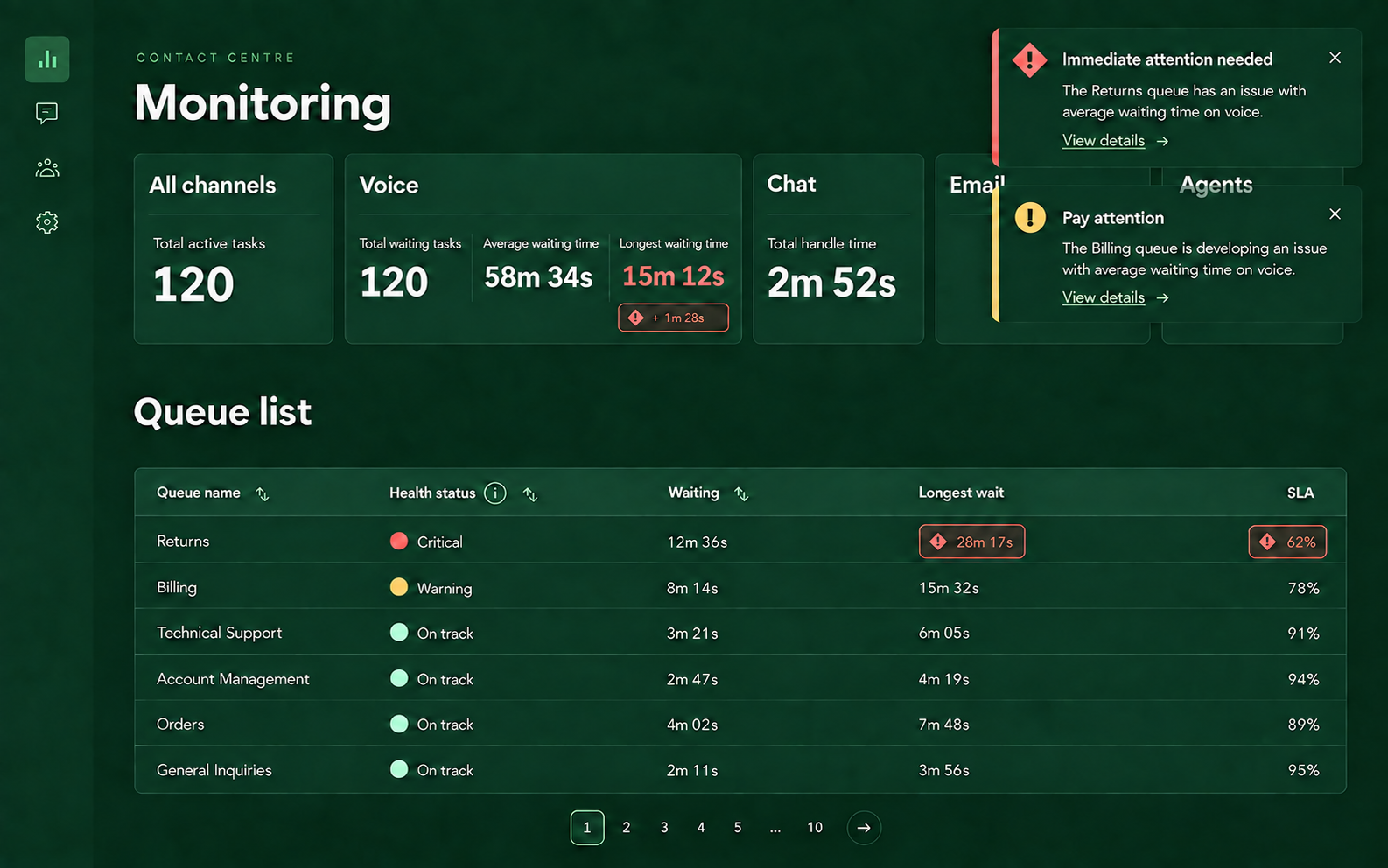
To address the lack of operational visibility, I introduced a health column and threshold-based queue states. Metrics communicated On track, Warning, or Critical, helping supervisors distinguish a healthy queue from an emerging or persistent issue. Filters helped supervisors focus on the relevant teams, queues, channels, or metrics.
Queue list
Queue name  Health status iNowWaiting NowLongest waitSLA
RefundCritical14m 02s21m 12s105%
PaymentsWarning12m 21s 82%
82%PayrollOn track4m 18s6m 42s73%
GeneralOn track3m 58s4m 13s69%
New usersOn track3m 32s5m 37s71%
InsuranceOn track3m 12s7m 11s72%
04
Rollups, alerts & notifications
Customer feedback showed that supervisors needed a combined view of their selected queues. Rollup metrics summarised the filtered queues using sums, maximums, and weighted averages appropriate to each metric.
Notifications extended the experience beyond active dashboard monitoring: warning, critical, being handled, and stabilised or resolved.
Alert behaviour
Alerts informed supervisors when a metric, queue, or channel reached a configured threshold. Warning signalled that an issue was developing; Critical indicated that immediate action was required. Each alert identified the relevant metric, channel, and queue. Alert creation and management remained an admin capability.
09
Scalability
A system designed to grow beyond one dashboard.
The structure allowed new metrics and integrations to be added without redesigning the whole experience. Configurable cards and tables supported different operational contexts, while reusable thresholds, health states, rollups, and notification patterns created a foundation for future capabilities.
Problems were mapped but not addressed in the delivered scope: delegated administration for external support providers, customer experience professional reassignment recommendations, and expanded predictive capabilities.
10
Outcomes
From manual reporting to proactive action.
Supervisors moved from spending more than three hours a day preparing and checking historical reports to receiving proactive notifications when an outlier appeared.
The new monitoring model also reduced the monthly number of historical reports issued per customer by three digits. Thresholds made ideal values visible to every supervisor, manager and quality controller, with clear context for whether an issue was active, being handled or resolved.
11
Takeaway
Supervisors did not simply need more data. They needed data working for them.
The experience shifted the platform from a passive place to look for information into an active operational support system. Instead of making supervisors search for signals across tools and reports, it brought relevant awareness to them, with context that helped them decide what to do next.
Receiving a signal → becoming aware of outliers → understanding context → taking action
- Expanded monitoring from 11 to 33+ metrics and shifted supervisors away from manually checking 1,500+ historical reports each month. The new model reduced reporting effort, made health thresholds visible and supported faster, more targeted action.
12
Tools & assets
I used the tools below and created the supporting icons, illustrations and interface assets in the same visual language as the case.
Interface design, user flows, journey mapping and delivery coordination.
Interviews, prototype testing, scheduling and research repository management.
Design system patterns, project documentation and product usage signals.
Reconstructed to match the Twilio-inspired render style and explain the workflow.
Project artefacts
UX briefingPRDFigma prototypesFigJam user flowSupervisor user journeyUX research reportUX report readout